23'-24' Vail/Summit County
Avalanche
Infographic
Project Type
Data collection/ Data Visualization
I moved out to Breckenridge, Colorado for the winter season to better learn about the snow side of the action sports industry.
During that time, I started split boarding, and avalanche safety went from being something I had heard about before, to a tangible threat I had to learn about...
A LOT OF Research
To read reports for the day, I would go onto the CAIC (Colorado Avalanche Information Center) website. I quickly realized I didn't know what half of the abbreviations or meaning behind key words were, so I made notes of all of those things.


This helped me build a basis to understand the information I was going to be organizing before creating a visual representation of it.
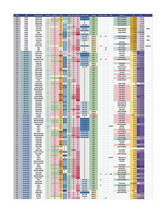
After looking through a few different reports, I started making an excel sheets with the information from the field reports. These were specifically categorized under Vail and Summit county. There were about 500 reports that I took info from between October and the end of April, which I considered the "winter season"


A LOT OF Processing
Next thing I did was sort the information that I had gathered. I focused on location between the average coordinate points given and the cities/territories those points were in or had been noted of.


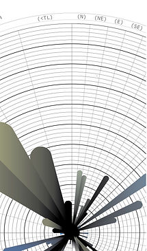
Made graphs on:
- Totals per category for each city/ territory
-Totals of lat/long based on .1 degree and .05 degrees to see where average amount of avalanches were.
-Entered all ava. coord. points (25 each ) into mass coord. point generator.
-Entered .1 and .05 coord. points into mass generator.
-Overlapped Colorado elevation map with coord points to create map grid that could be filled in with colors corresponding to avalanches per area.

Ideation
Ideation of what the visuals jumped around a lot since I felt like there were so many areas to address, compare, and create systems for. Also as I started finalizing the beginning parts pieces of the info graph it caused me to turn different directions and recognize problem areas or what would be most concise and consistent in communicating the info.


Creation
I used my ideation sketches to make base systems to then create the actual visuals. Once in illustrator, I used the extra graphs I had made to create parameters, that I then adhered the designs to. I then just filled them in. I tried to use consistent colors to create a sense of unity that also related to the different categories of the graphs. These are the basic layouts for the graphs.